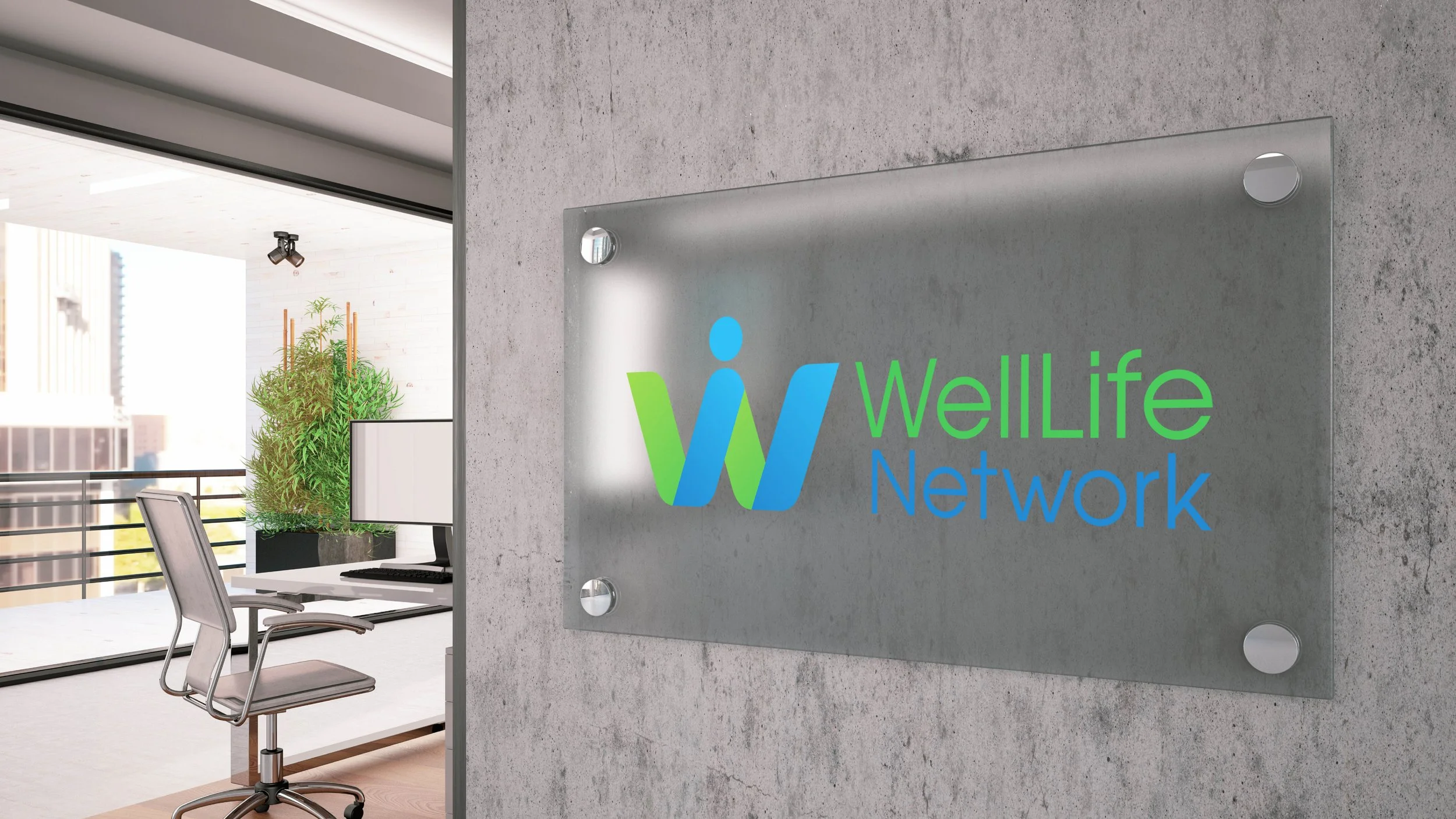
WellLife Network
Brand Identity Development

Marketing

The primary goal of the branding development project for WellLife Network is to establish a cohesive and visually appealing brand identity that aligns with the organization's mission of empowering individuals and families through comprehensive support services.

Color Palette

Eco Green Gradient, Fresh Grass Green, Turquoise Water Blue, Sky Blue, Honest Blue Gradient, Vibrant Teal, Pale Sky Blue, Vivid Cyan Blue, Mystic Forest Teal, Twilight Cascade, Tropical Lagoon. These colors convey a sense of tranquility, trust, and wellness, reflecting the organization's commitment to mental health and community support.

Typography

Primary Typeface: Avant Garde Medium

Secondary Typefaces: Futura PT Book, Futura PT Demi, Acumin Condensed Regular, Acumin Condensed Bold.

The combination of these typefaces provides a modern, clean, and professional look, enhancing readability and aesthetic appeal.

Design and Layout

The branding materials exhibit a structured and organized layout, ensuring clarity and ease of navigation. Consistent use of colors and typefaces across various services creates a unified brand identity.

The branding development for WellLife Network effectively captures the essence of the organization’s mission and services. The thoughtful selection of colors, typefaces, and structured layout creates a professional and cohesive brand identity. This branding approach not only enhances the organization's visibility but also reinforces its commitment to supporting and empowering individuals and families within the community.

Next
Next

WellLife Network Board Recruitment Advertising